In 1988 I bought ‘Lovesexy’ to listen to on my walkman on a school trip to France. After that I was hooked until the mid 1990s when my tastes broadened and encompassed other genres and artists.
When I heard about Prince’s death I didn’t want to listen to the music – music that has brought me so much joy – it didn’t seem right to listen to it while sad. Instead I turned to my vinyl collection, not to play, but to look at. Ah the comfort in those the magic words ‘Produced, arranged, composed and performed by Prince’. I started to realise that the graphic design of these records that surrounded me in my formative years had as much influence on me as had the music.
Prince’s style, be it fashion, music, photography or graphics changed from album to album. There is so much variety, even b-sides get special design treatment. I wanted to put this post together to celebrate the typography and lettering, concentrating on singles.
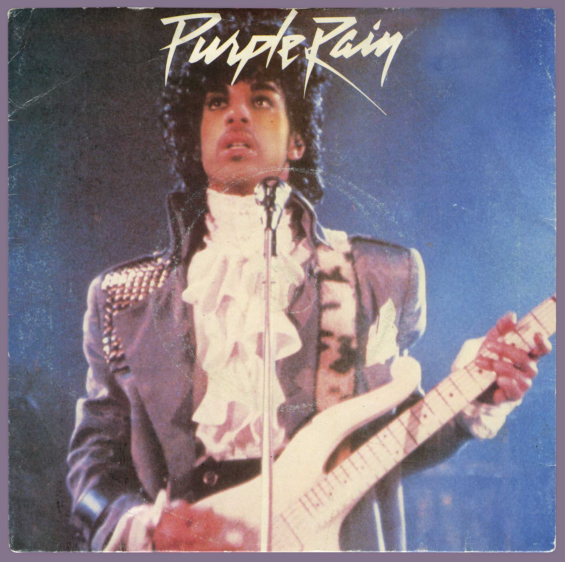
Purple Rain
From the album
Purple Rain
Date
1984
Format
7" Single
Purple Rain launched Prince into the mainstream. The logotype designed by Jay Vigon should be recognised as contributing to the success. The bespoke lettering is perfect with it's diacritic raindrop. It was used for the film, album and single.
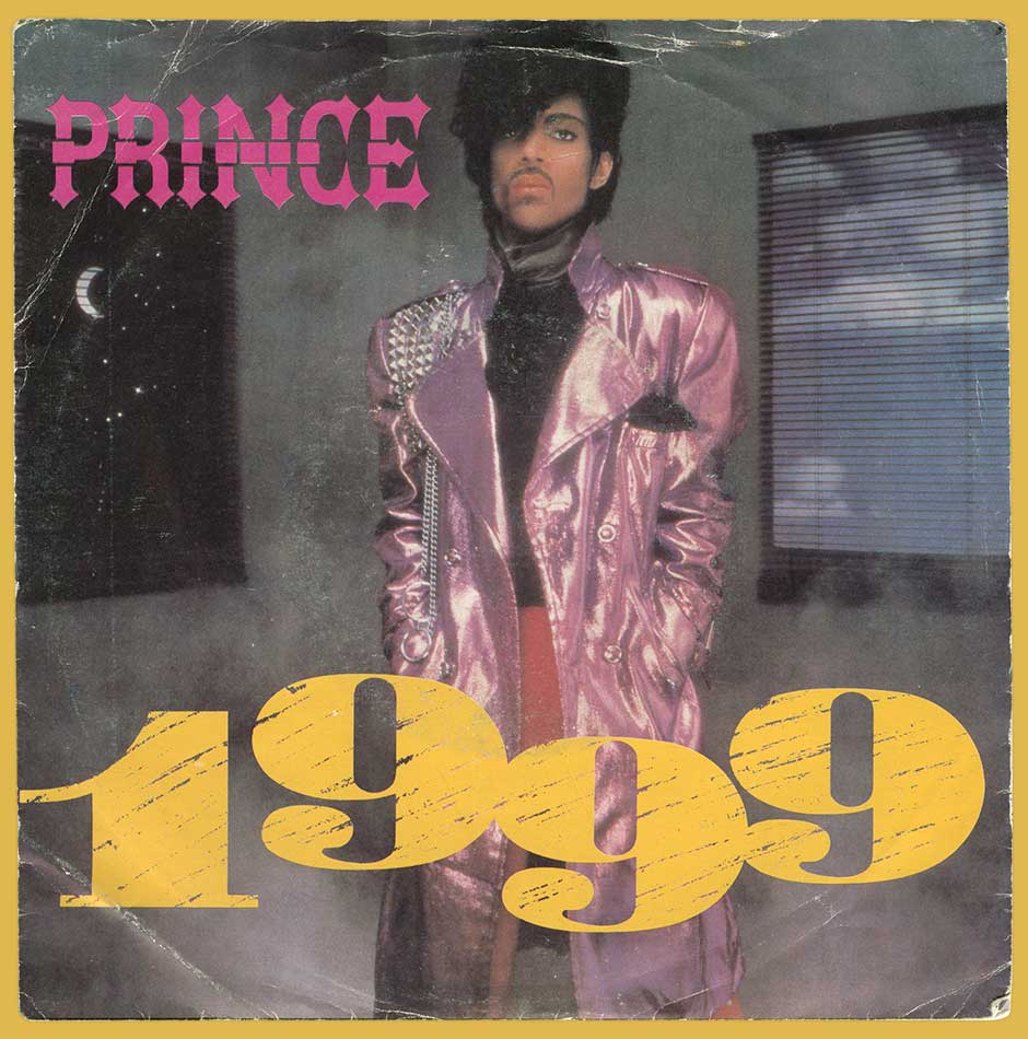
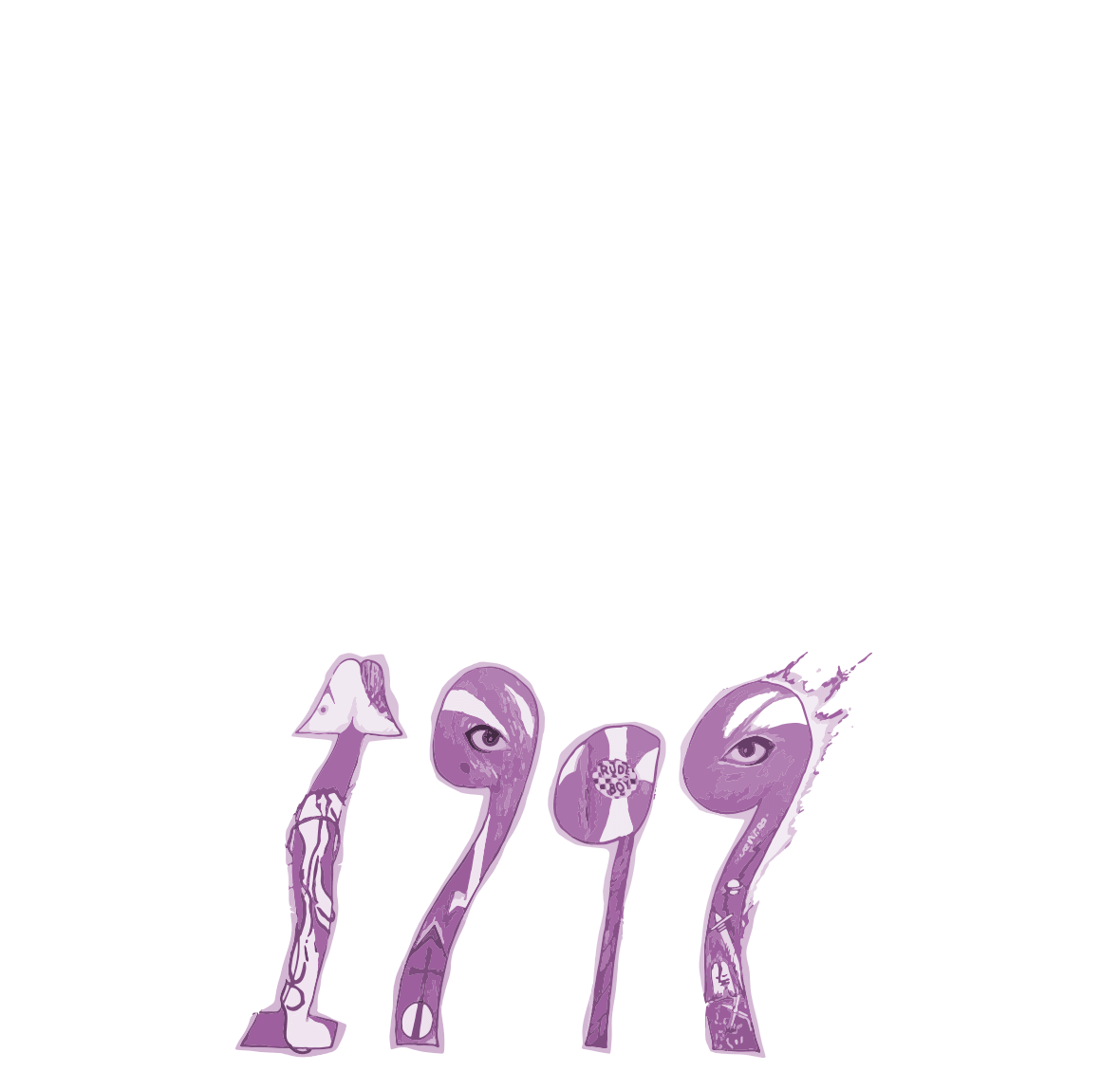
1999
From the album
1999
Date
1982
Format
7" Single
The type of this 1999 French release is quite different from the British and American one. I can only assume a choice was made to go with something a little less risqué.
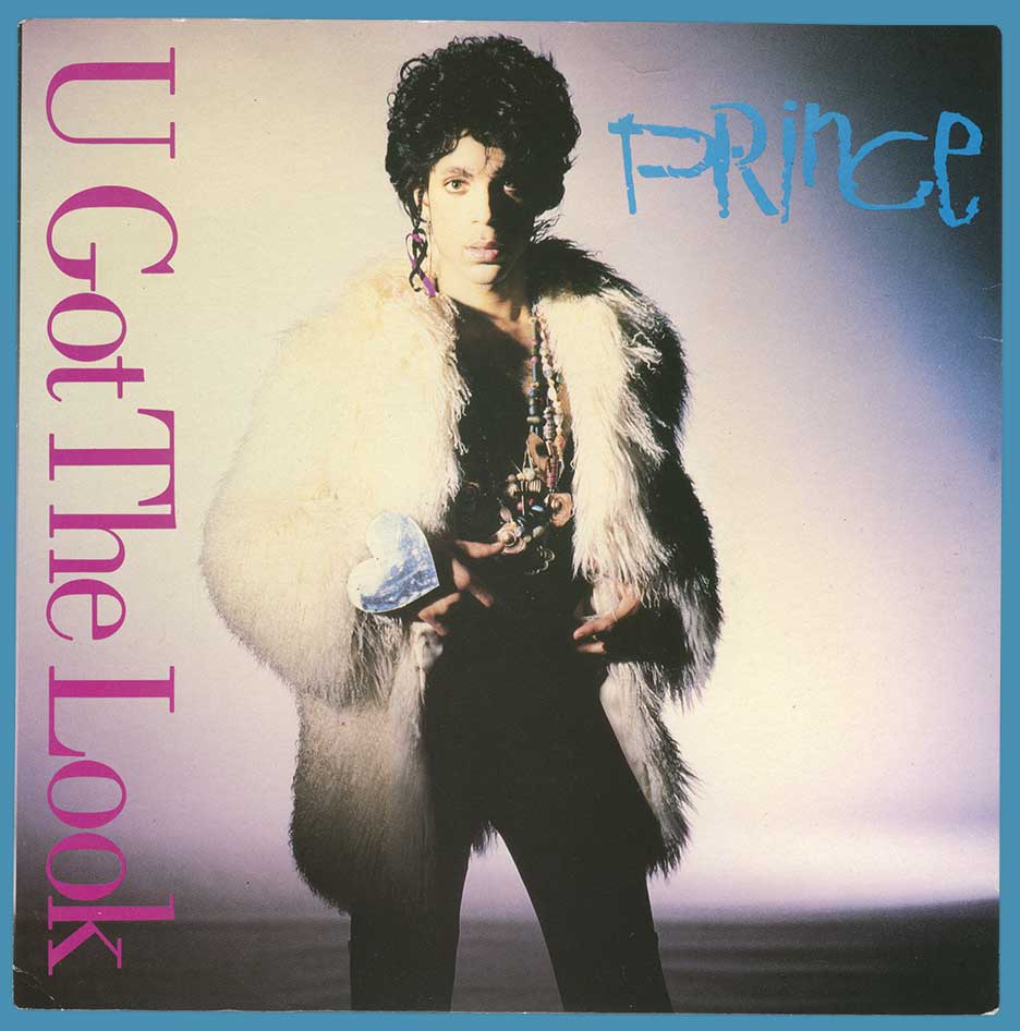
U Got The Look
From the album
Sign O' The Times
Date
1987
Format
7" Single
Bodoni has been used here and on the other singles 'If I Was Your Girlfriend' and 'I Could Never Take The Place Of Your Man' from the 'Sign O' The Times' album. While the albums' namesake uses the bespoke logotype. Design is most likely by Laura LiPuma Nash Graphic Designer at Warner Bros. Records.
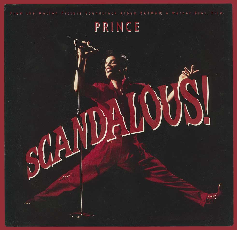
Scandalous
From the album
Batman
Date
1989
Format
7" Single
While the first three singles from the 'Batman' album very much stayed in keeping with the film and album brand, 'Scandalous' exploded with wonderful design and the lettering appears to scream with a shudder through it. The single is credited with design by Tom Recchion and Photography by Jeff Katz. The 12" has an extended title 'The Scandalous Sex Suite'.
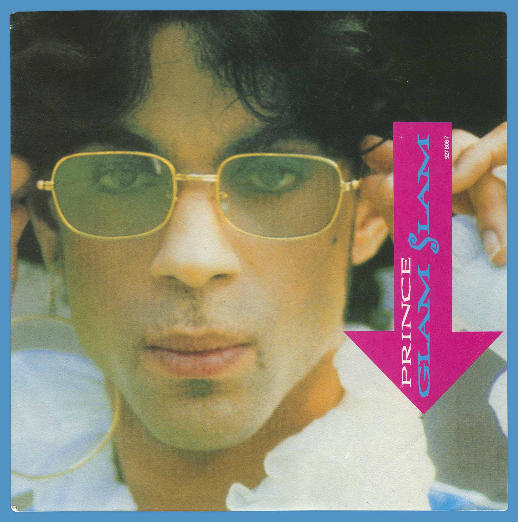
Glam Slam
From the album
Lovesexy
Date
1988
Format
7" Single
All three singles from 'Lovesexy'; 'Alphabet St.', 'Glam Slam' and 'I Wish U Heaven' use the same Lovesexy style lettering, where an 'eye' is used for 'I.' Lettering by Margo Chase. Design could be by Laura LiPuma Nash but this single design is not credited to her where as 'I Wish You Heaven' is.
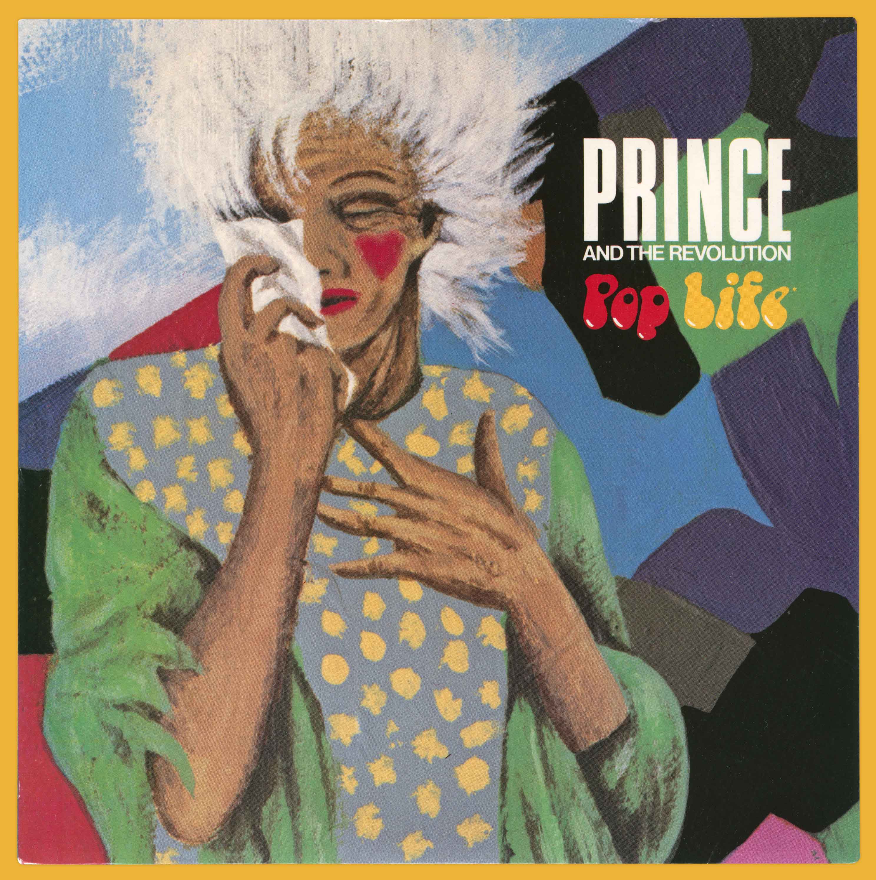
Pop Life
From the album
Around The World In A Day
Date
1985
Format
7" Single
Three out of four singles from 'Around The World In A Day' feature elements of Doug Henders album illustration. All of them have unique lettering. The b-side to this UK release has 'Girl' written in the 'Paisley Park' style but in the shape of a circle. The design is most likely by Laura LiPuma Nash Graphic Designer at Warner Bros. Records.
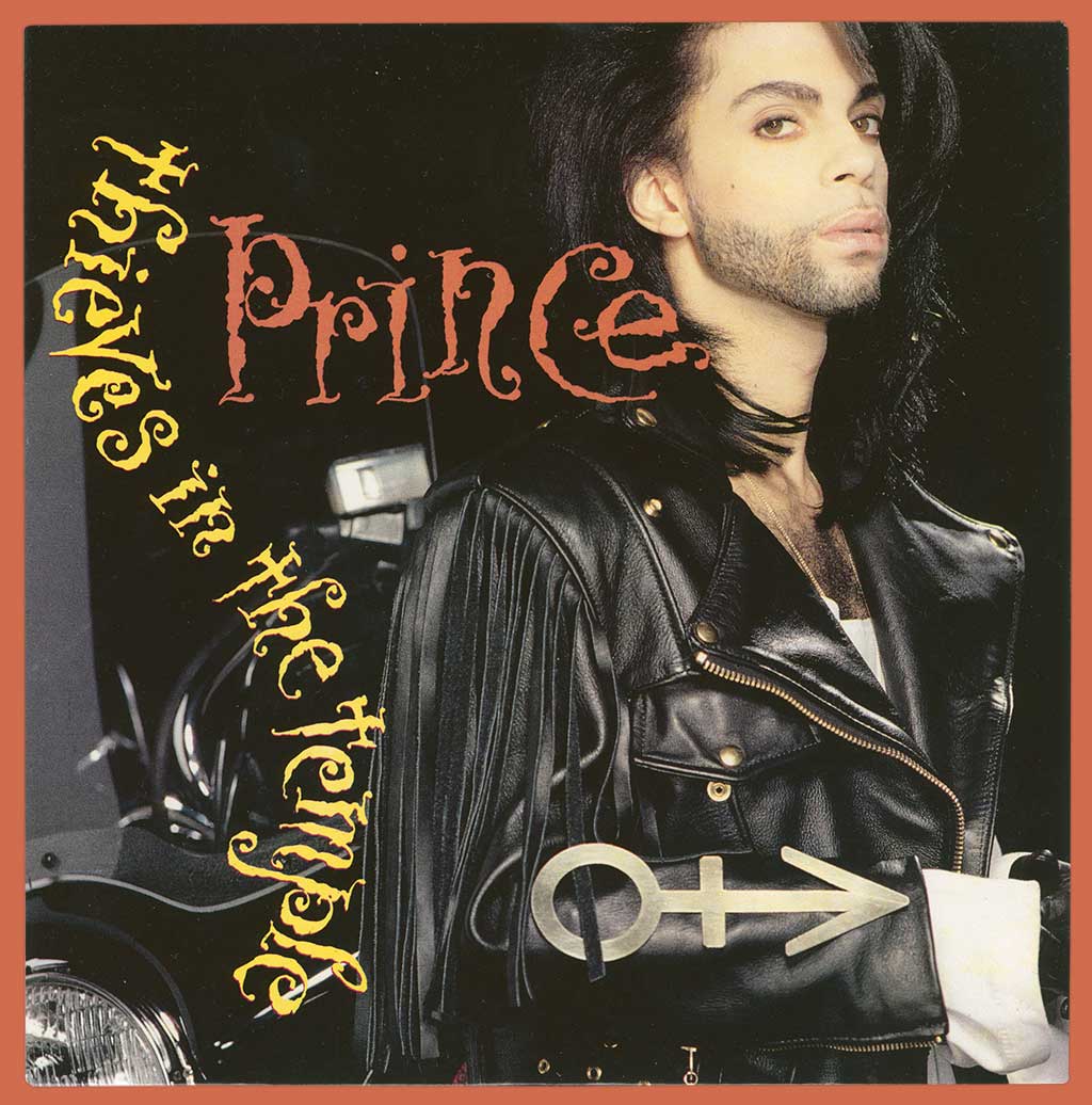
Thieves In The Temple
From the album
Graffiti Bridge
Date
1990
Format
7" Single
This single uses the same lettering as the 'Graffiti Bridge' album artwork there is a definite feel of the 1990s here. Lettering by Margo Chase. Artwork credited to Tom Recchion and photography by Bob McNamara.
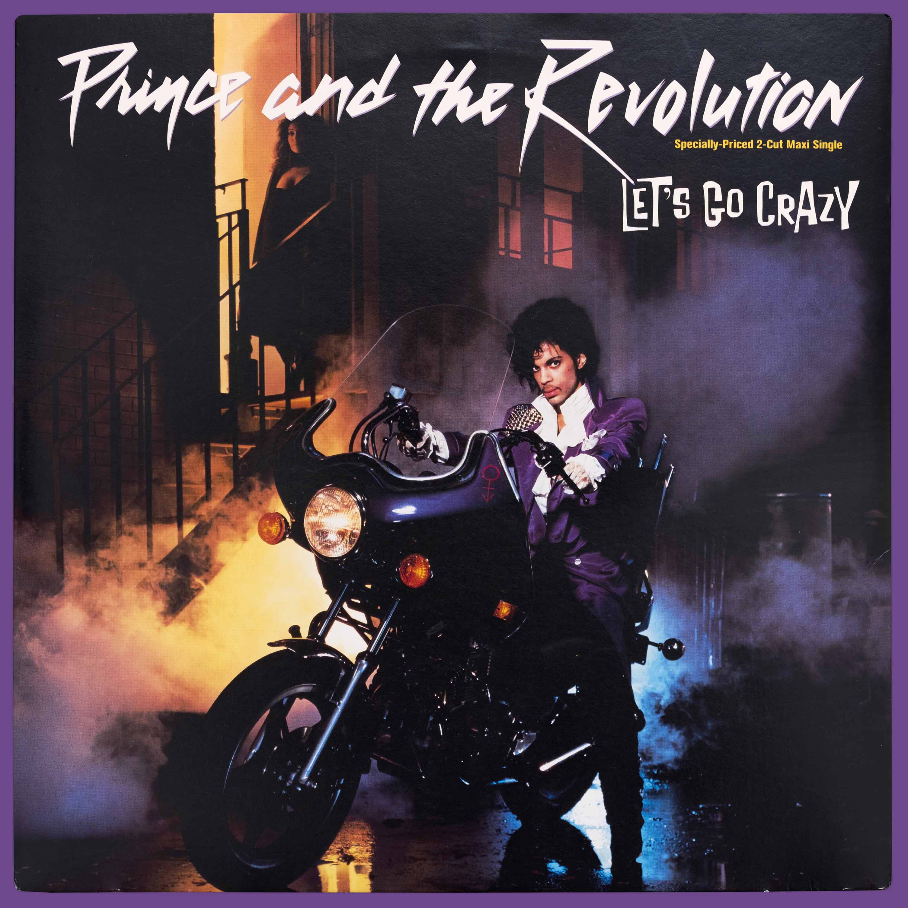
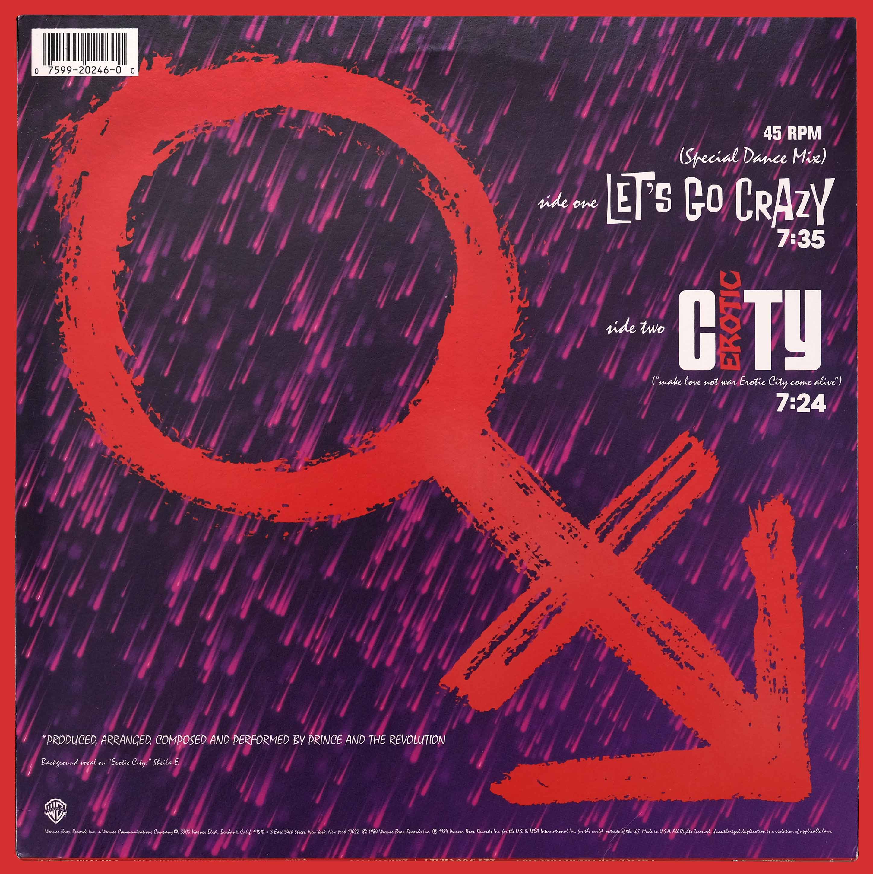
Let's Go Crazy
From the album
Purple Rain
Date
1984
Format
12" Single
Each single from 'Purple Rain' uses a unique typeface or lettering. 'Let's Go Crazy' and 'Purple Rain' being more memorable perhaps due to the bespoke lettering and suitability to the subject matter. Design is by Laura LiPuma Nash Graphic Designer at Warner Bros. Records. It was Laura who spotted the 'Love Symbol' on the motorbike and sketched it up for future graphic design use.
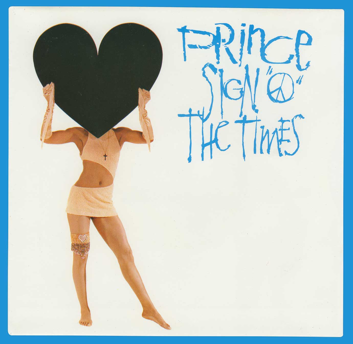
Sign O' The Times
From the album
Sign O' The Times
Date
1987
Format
7" Single
This single always stands out for me as unusual (but brilliant) as Prince sings about about contemporary 1980s life; drugs, guns, AIDS, hunger, bombs. The lettering reflects that with the CND symbol and it's grungy style. All the other singles from 'Sign O' The Times' use Bodoni typeface. Design is most likely by Laura LiPuma Nash Graphic Designer at Warner Bros. Records.
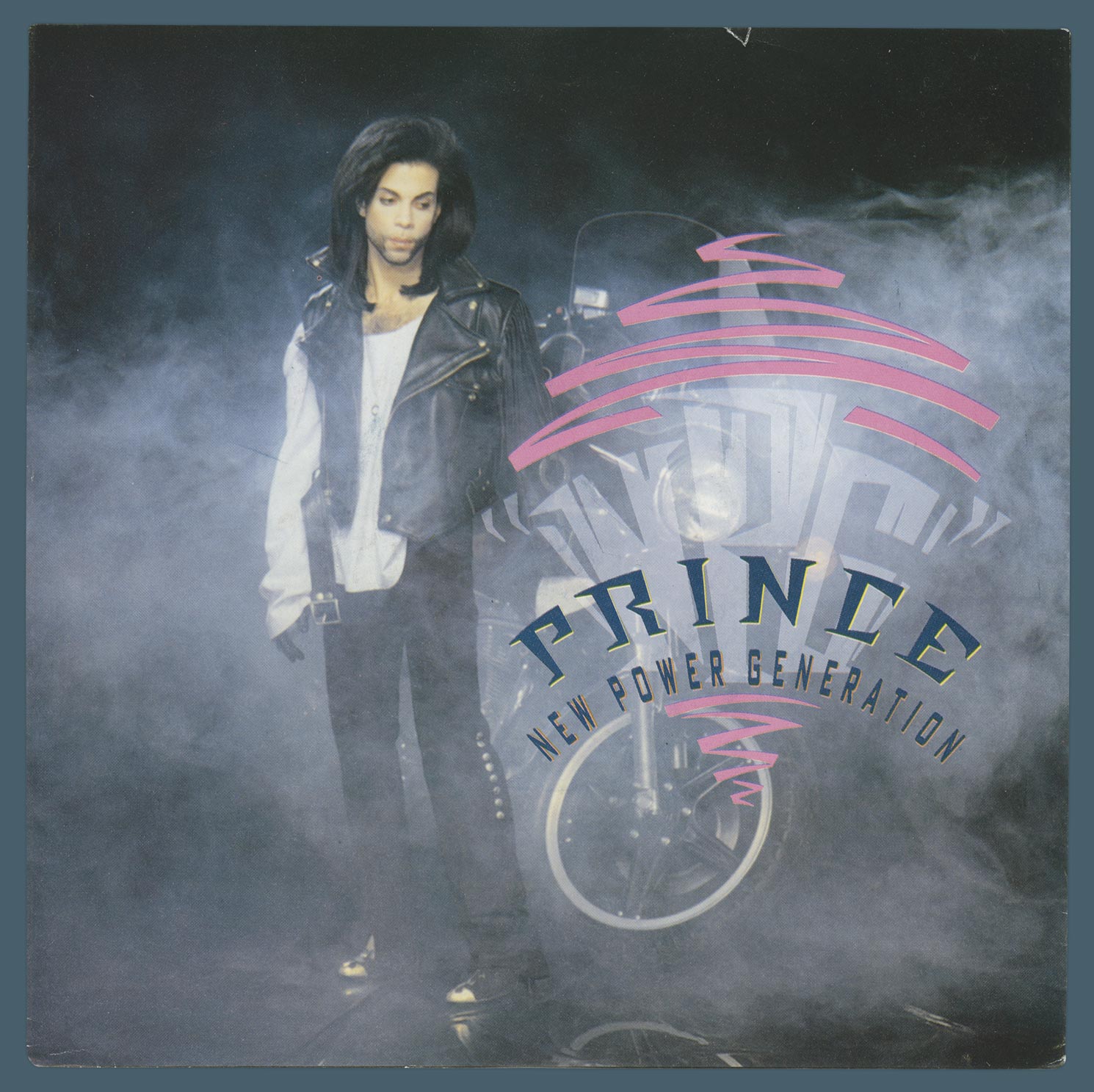
New Power Generation
From the album
Graffiti Bridge
Date
1990
Format
7" Single
With a late 1980s and early 1990s feel NPG feels playful and childlike. The lettering stands alone from the 'Graffiti Bridge' art work and lettering. Lettering by Margo Chase, design is most probably by Tom Recchion.
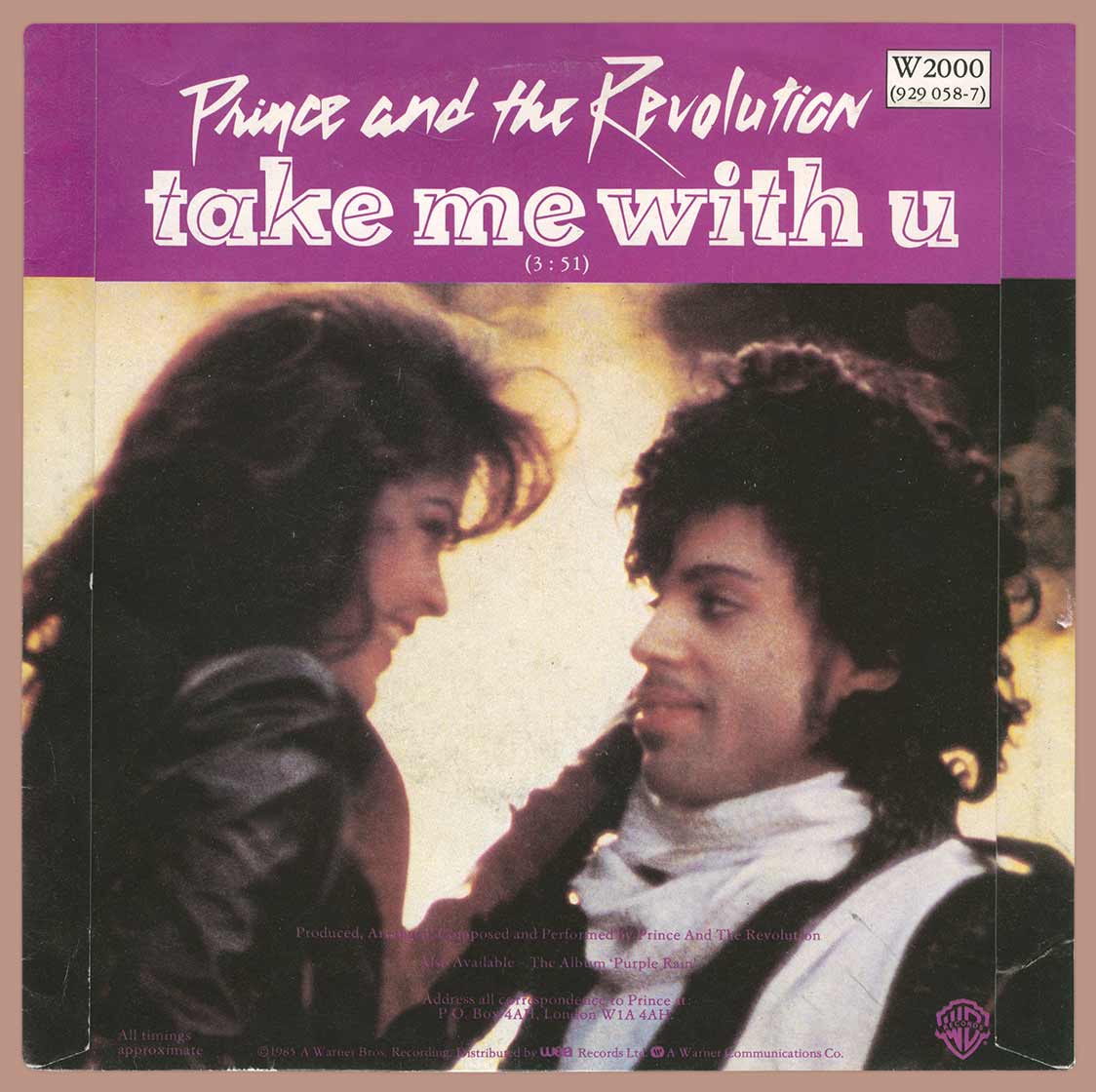
Take Me With U
From the album
Purple Rain
Date
1985
Format
Double A-side 7" Single
This typeface has eluded me! I'm hoping the design community can help me out. I do like the way the light font has fit into the slab serif. Design is most likely by Laura LiPuma Nash Graphic Designer at Warner Bros. Records.
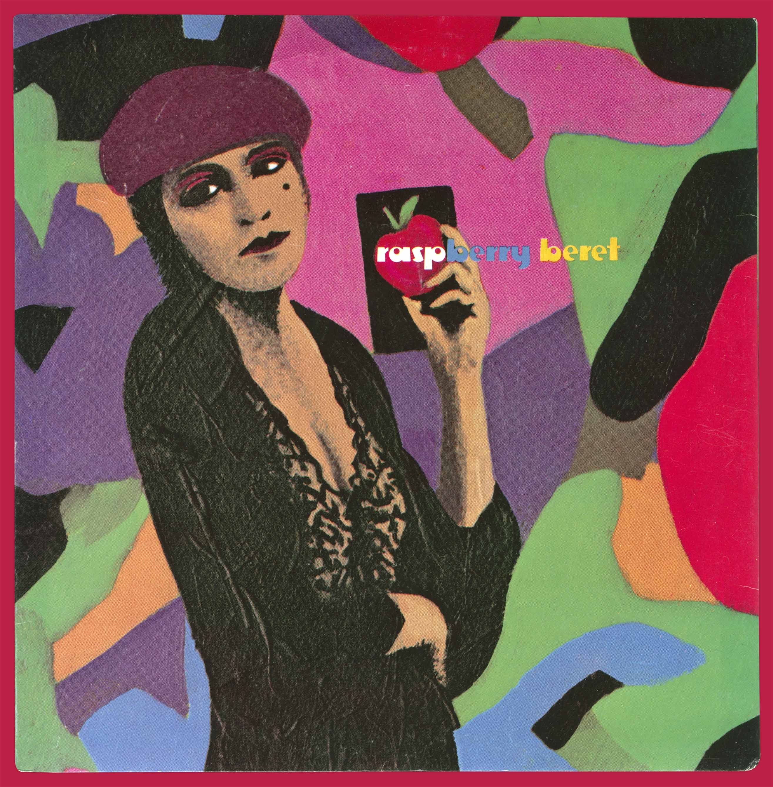
Raspberry Beret
From the album
Around The World In A Day
Date
1985
Format
7" Single
Three out of four singles from 'Around The World In A Day' feature elements of Doug Henders album illustration. All of them have unique lettering. The b-side to this UK release has 'Hello' written in the 'Paisley Park' style but in the shape of a circle. Design is most likely by Laura LiPuma Nash Graphic Designer at Warner Bros. Records.
1999
From the album
1999
Date
1982
Format
12" Single
It's unusual that this 1999 single looks just like the cover of the album. 1999 is my favourite period of Prince design and photography, I like the unpolished nature of it. I can't find anyone to credit, perhaps Prince himself was the artist? The design features elements from the previous album Controversy and the number one in the '1999' has a phallic shape.
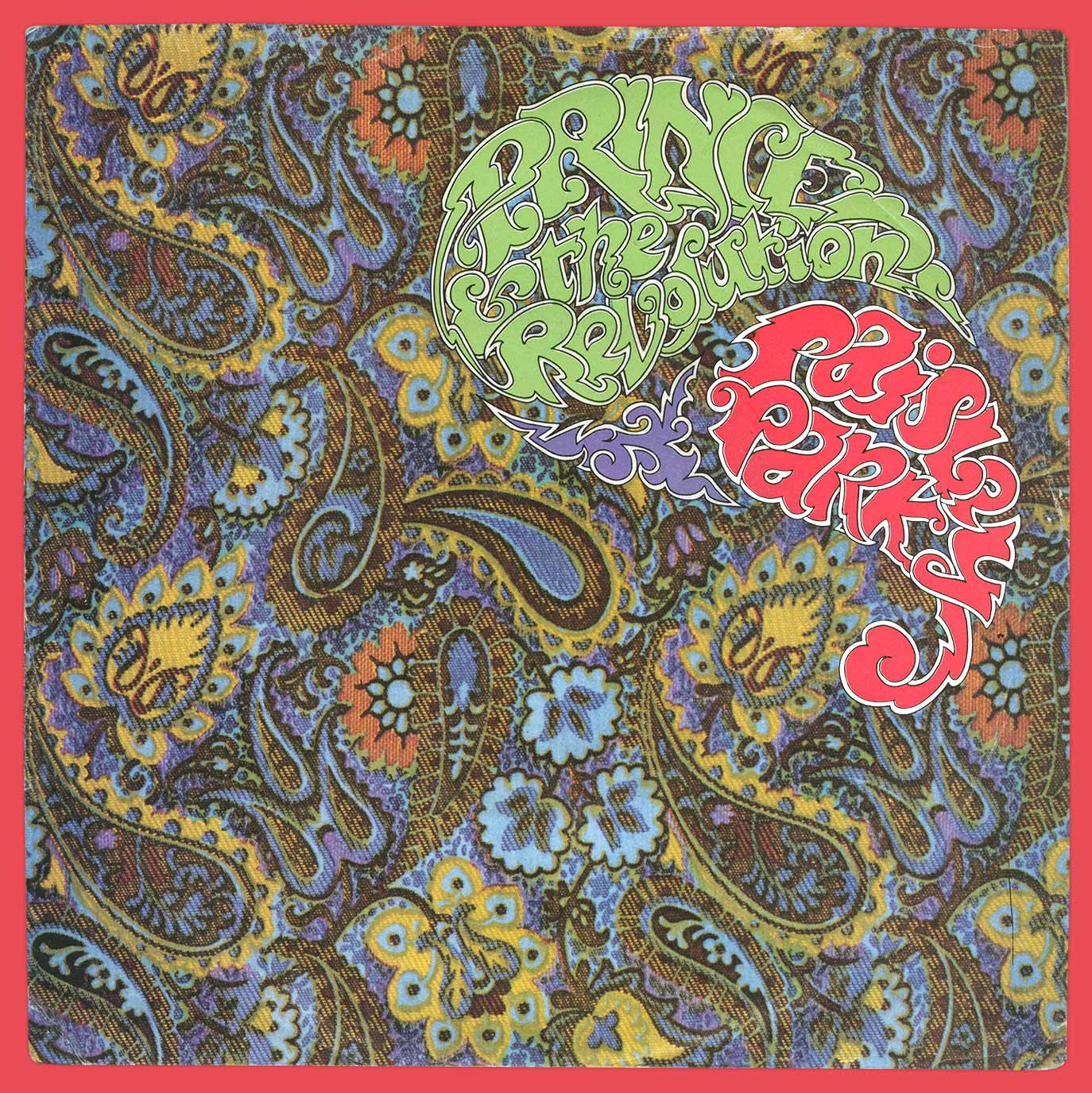
Paisley Park
From the album
Around The World In A Day
Date
1985
Format
7" Single
The iconic logo of Prince's studio shares the name and lettering for this single. Most of the singles from the 'Around The World In A Day' album feature elements of the illustrated album art work by Doug Henders, but this one goes all out on the paisley theme. The b-sides for some of the other singles have the same typography but in a circle rather than a paisley shape. Lettering by Margo Chase, the design is most likely by Laura LiPuma Nash Graphic Designer at Warner Bros. Records.
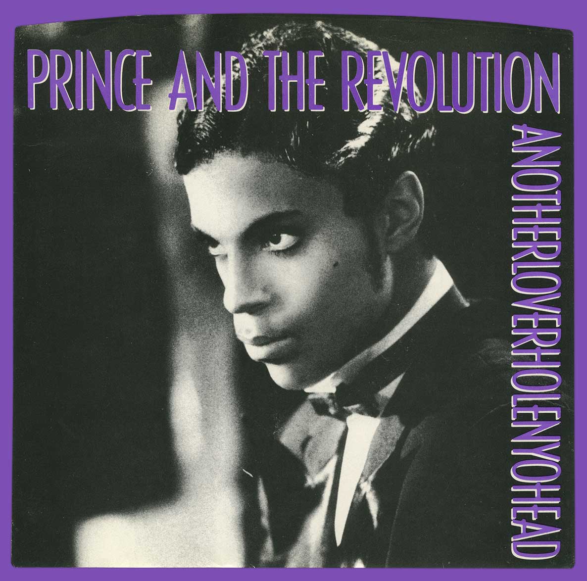
Anotherlover
holenyohead
From the album
Parade
Date
1986
Format
7" Single
Romeo typeface is used here doubling it up with nice effect. 'Parade' photography and design was very stripped back compared to previous album and single releases. Photography is black and white, typefaces are classy and grown up. It all fits in nicely with the film 'Under The Cherry Moon' filmed in black and white and set France. Laura LiPuma Nash Graphic Designer at Warner Bros. Records convinced Prince to take the design in this direction.
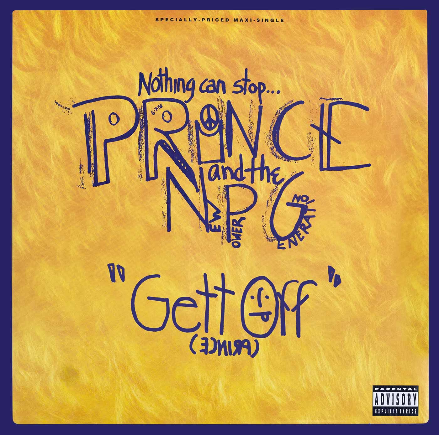
Gett Off
From the album
Diamonds and Pearls
Date
1991
Format
12" Single
I'm not a huge fan of the 'Diamonds and Pearls' aesthetic so I like that this single breaks away from it. It's nice to know these are the scribblings of Prince (with lots of drawing and mirror lettering on the back of the single). He is credited, but as ECNIRP, Prince spelt backwards.
Erotic City (b-side of Let's Go Crazy)
From the album
Purple Rain
Date
1984
Format
12" Single
Each single from Purple Rain uses a unique typeface or lettering. It's most satisfying when the b-side titles feature bespoke designs too. Design is by Laura LiPuma Nash Graphic Designer at Warner Bros. Records. It was Laura who spotted the 'Love Symbol' on the motorbike on the front photo, sketched it up and used it here for the first time.
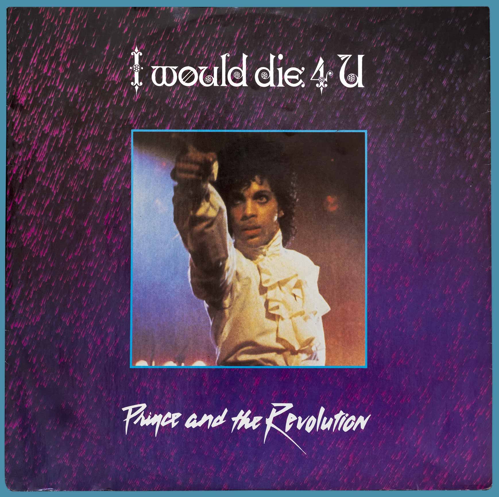
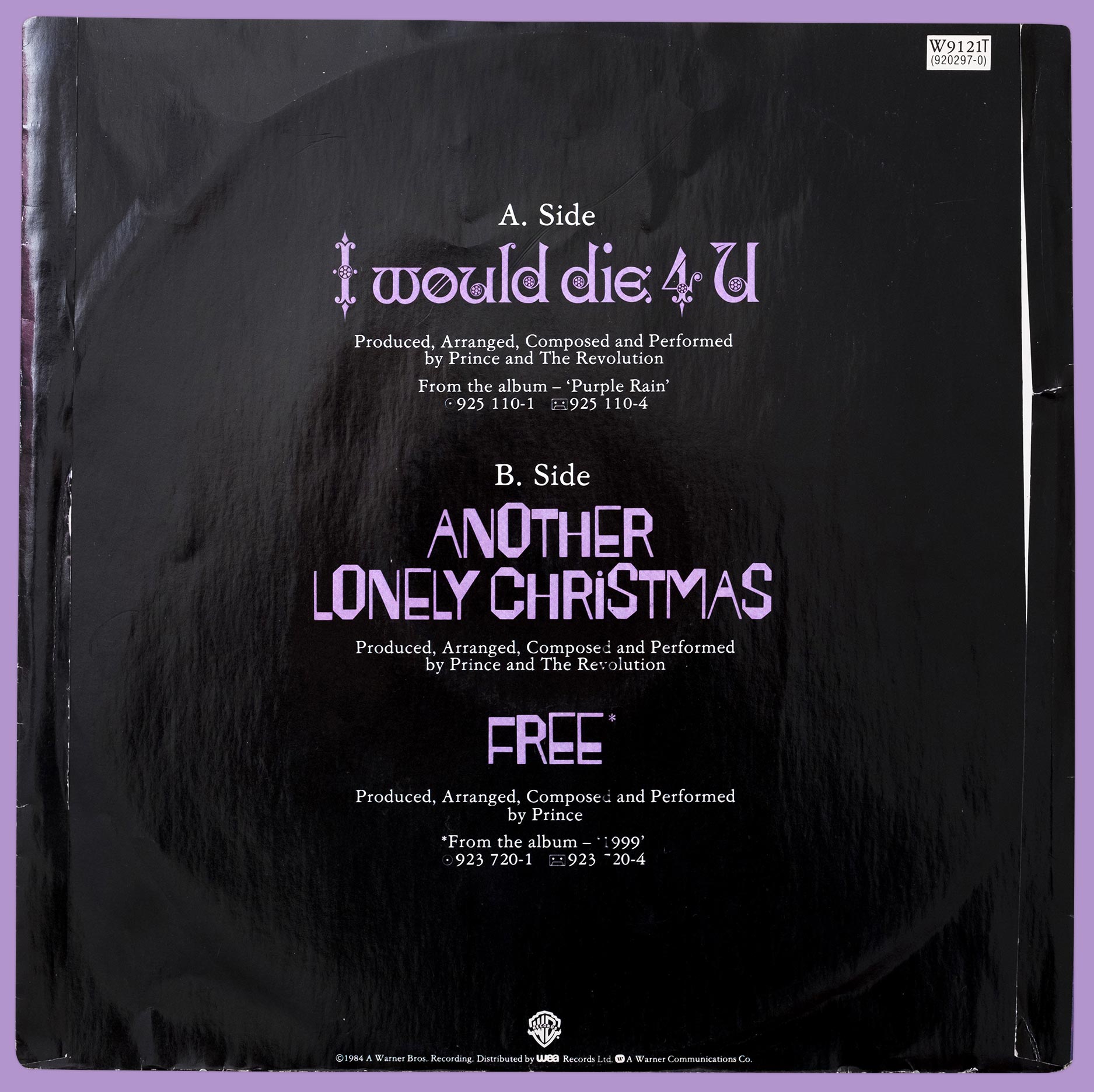
I Would Die For U
From the album
Purple Rain
Date
1984
Format
12" Single
Each single from 'Purple Rain' uses a unique typeface or lettering. 'I Would Die For U' uses
Karnac typeface. Karnac is also used for 'God' the b-side of 'Purple Rain'. Design is most likely by Laura LiPuma Nash Graphic Designer at Warner Bros. Records.
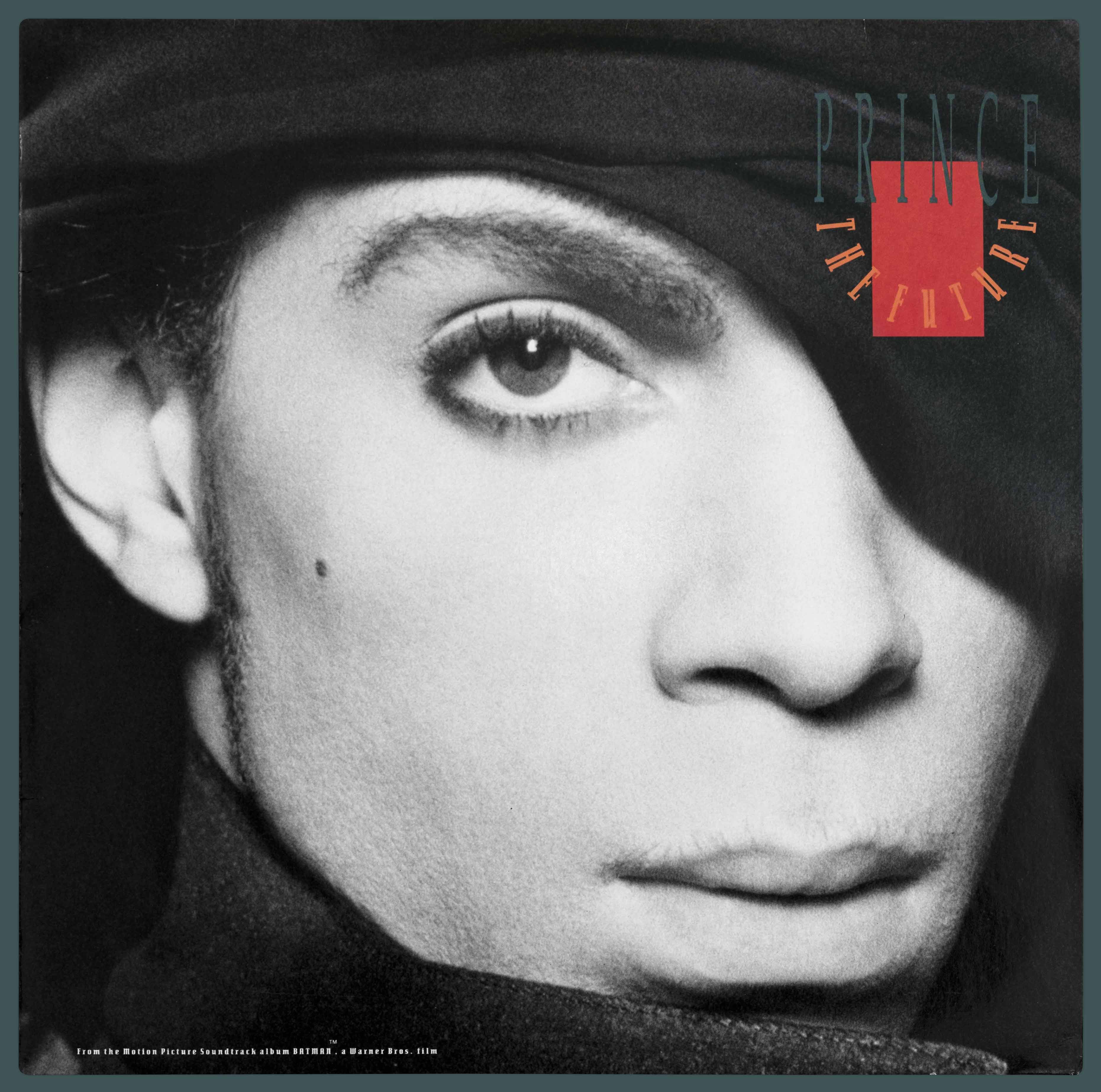
The Future
From the album
Batman
Date
1990
Format
12" Single
While the first three singles from the Batman album very much stayed in keeping with the film and album brand, Scandalous exploded with wonderful design and the lettering appears to scream. The Future is more sedate and cool. Photography by Matthew Rolston and design by Tom Recchion. Remix by William Orbit.
Another Lonely Christmas (b-side of I Would Die For U)
From the album
1999
Date
1982
Format
12" Single
Each single from 'Purple Rain' uses a unique typeface or lettering. It's most satisfying when the b-side title feature bespoke lettering too. Design is most likely by Laura LiPuma Nash Graphic Designer at Warner Bros. Records.
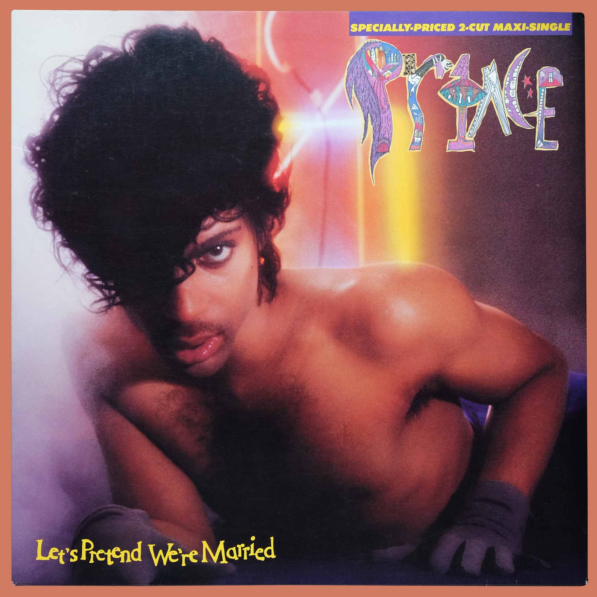
Let's Pretend We're Married
From the album
1999
Date
1983
Format
12" Single
Perhaps a little thrown together "use that image we have and cut out the Prince name from the LP and make sure everyone knows its a maxi single" I do however like the lettering for 'Let's Pretend We're Married'.
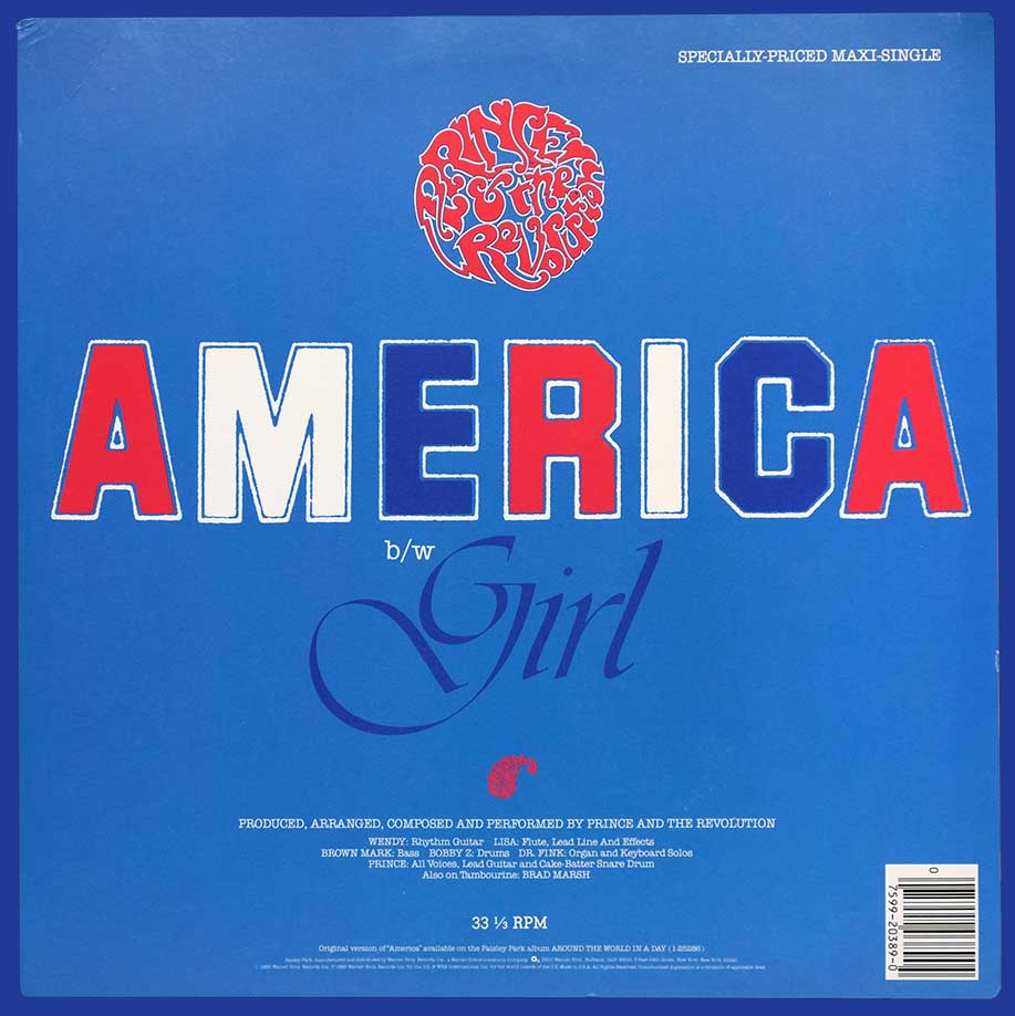
America
From the album
Around The World In A Day
Date
1985
Format
12" Single
Three out of four singles from 'Around The World In A Day' feature elements of Doug Henders album illustration. All of them have unique lettering. This uses a slightly grungier version of the
Superstar typeface. Unusually on this one there is no text on the cover - just a boy with an American flag. This shows the flip side and you can also get an peek at the typeface used for b-side 'Girl'. Design is most likely by Laura LiPuma Nash Graphic Designer at Warner Bros. Records.


Great to point the graphics of Prince out. I loved Prince’s graphic design and album cover artwork that I ended up choosing graphic design and art direction for career.
As a teen I would redraw the ‘Around In The World In A Day’ psychedelic logotypes and even the ‘Sign “☮†The Times’ hand lettering, all exactly to the tee, here’s an example of my hand re-drawing at 17 year of age: https://www.pinterest.com/pin/389491067746867457/
All straight PEN, no pencil, no tracing, hand drawn.. exactly like how the SOTT lettering was done.
Years later while attending my art and design college coincidently one of my design professors was one of the designers that worked on Prince album covers at Warner Bros. She said, the SOTT album lettering was ALL hand done, Bodoni was used for the lyrics and some of the singles song titles.
From Around The World in A Day to Graffiti Bridge, those logotypes were created by Margo Chase who worked for many big labels and names. She was a medical illustrator from what I remember when she gave a presentation at Otis. I was thrilled to have her at my school! Crazy coincidences, I have many more in terms of Prince.
Anyway, the point I want to make is that Prince was engaged in creating the album artwork for his Warner Bros Records years HOWEVER real, talented, tasteful art directors and graphic designers MADE SURE that Prince’s vision was done correctly, spectacularly and with a real sense of design and art. Most of it was pre-computer based graphics mind you or early early PaintBox graphics like the Lovesexy album cover.
After Warner Bros, Prince hired a sole illustrator who didn’t have the level of talent in typography, graphic design but was a really, really talented and gifted painter and illustrator. Prince’s albums took a complete nose dive in terms of artwork and packaging, even photography wasn’t as good as say the work of Jeff Katz. There were two designer Prince used after WB that weren’t on the level that WB had and PROVIDED back in the day.
This is true and you will see it if you know anything about graphic design, proper art direction and you’re honest with what you are seeing, it’s there.
Thanks for focusing on this element, perhaps we’ll hear stories from the designers and art departments at Warner Bros Records.
PS – I know, why are you supporting a big record label? They hired the right people, and did offer a level of support, talented support that simply wasn’t something that was there post WB because of Prince’s independent status, he had to deal with many of the logistics himself, including album packaging in which he hovered over the shoulders of his “graphic designers”, the worst thing to do to a graphic designer/art director.
Hi Modernaire
Thanks so much for taking the time to comment on the post. Really pleased to be able to credit Margo Chase – her work is wonderful. I do hope some designers get in touch – it would be great to hear their stories.
Thanks again, Jane
Lovely work and nice to see the typography singled out.
My fav is the Lovesexy typography.
You might want to amend the Under the Cherry Moon date reference
😎
Thanks Gaz. Lovesexy is a favourite of mine too. Cheers, Jane
Great post. Sadly, Margo Chase perished in an aviation accident in July 2017.
http://www.latimes.com/business/hollywood/la-me-marg-chase-obit20170726-story.html
Hi Josh. Thanks for the information – so sad to read about Margo Chase. Jane
Don’t forget Chank Diesel!
http://blog.thecurrent.org/2016/06/25504/
Ah – interesting – didn’t know about Chank Diesel! Thanks
Seems as if some of the info in this article is incorrect like I Would Die For You is not from the 1999 album but from the Purple Rain album amongst other things
Ah yes – you are quite right. I’ve checked through the page and hopefully got all the amends! Cheers
Lovesexy typography is something amazing. Really liked the concept of being singled out. Thanks for sharing it. I’m bookmarking your blog for future reference as I may need it in my next logo design project.